Scroll down to watch the work develop.

As I began, I decided that I didn't like the yellow tone of the wood beneath my still life. So I put grey velvet under it, to make the red and yellow colors more vibrant-looking in the finished piece.

The green I used for the drawing/wash is viridian with quinacridone gold added to warm it up some.

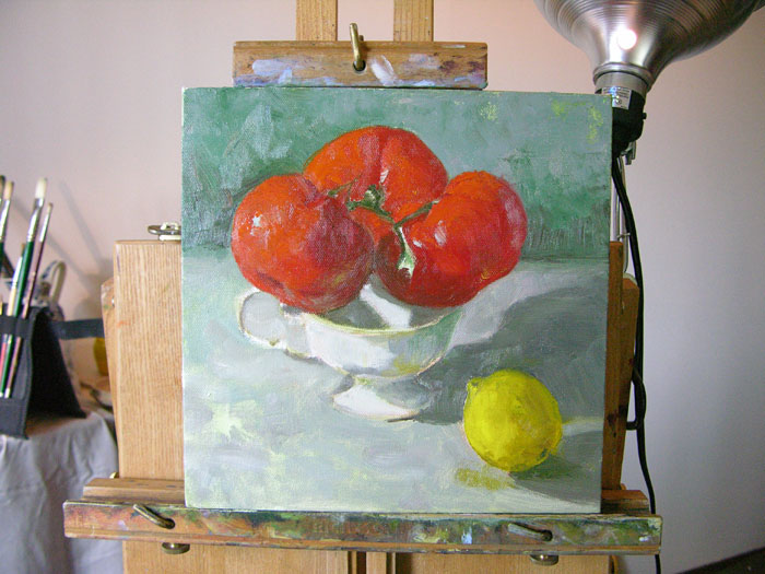
About the colors: every red you see was mixed with some green to render it more natural (my camera, unfortunately, oversaturates reds so that subtlety is lost). The shadows on the tomatoes are done by blending dark green into my red paint; the shadow on the lemon is done by adding cobalt violet to my yellow.
Anyone who wants to know exactly which pigments I am using for which parts is welcome to ask in the comments here. I love talking about what I'm doing, and this, for me, is a bit of an experiment. For one thing, I'm not in the habit of using grey this way. I like it a lot so far, though.
Look for more updates tomorrow!
The painting looks beautiful..Great piece of art..
ReplyDelete